Website design lessons from the best
By Toby Ward - The top 20 most popular websites on the planet are all portals, search engines, and social media sites: Google is #1, followed by Facebook and YouTube (source: Alexa.com). Scattered conspicuously amongst the top 100 websites are a few, rare corporate websites:
Microsoft Corp. (23rd overall)
Apple Inc (37th overall)
Adobe Systems (64th overall)
Let’s face it, corporate websites are boring, and fulfill a fraction of the need and entertainment value of a viral social media tool or a portal site that attempts to be everything to everyone. However, the need is still there, even if the explosive traffic can’t match Facebook; people use corporate websites, only more sparingly and for very specific purposes. Corporations that ignore or neglect their corporate website do so at their peril.
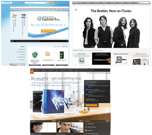
Of the three corporate websites in the top 100, there are some key lessons and universal truths about corporate website home pages that most if not all organizations should learn from and apply to their own websites. Not all of the websites are the same, and some break rules that others follow, but for the most part, the Apple, Microsoft, and Adobe home pages follow the same, basic approach as seen below.

Homepage comparison of Microsoft, Apple and Adobe
1. Keep it simple, stupid
This is an old lesson that still needs to be learned again and again, and Apple is the champion of this mantra, which is reinforced not only by the website, but in all its design and products. Even arch nemesis Microsoft is beginning to learn the simplicity lesson, though not to the same degree as Apple.
Apple.com features simple, small banner navigation above a major promotional item, supported by lesser promotional items and links to other areas. Microsoft and Adobe follow suit, although to a lesser extent with a slightly busier and more colorful page. But all three follow the basic, general format. The everything-and-the-kitchen-sink approach to the home page is gone:
Emphasize a streamlined global navigation and access to most of the site content
Promote a few key products or initiatives
Provide link groupings as an alternate path to information
2. Multiple navigation paths
No two website visitors are alike. Some people like to surf through sections, others go right to the search engine, still others prefer a site map or simply read the entire page and then decide to click on the most relevant link.

Adobe Help and Support
Adobe understands this and in fact, immediately under the lead promotional feature provides online Help and Support links for users who have a specific question or want to talk to a real person. Moreover Adobe doesn’t hide its Contact Us link (like most damned websites that do everything in their power to discourage you from phoning or emailing them); the Contact Us link is right in the footer of each page, and front and center on the Support page.
Unfortunately, though it’s so easy to execute with almost any content management system, the Adobe site offers no visible link to a Site Map (Microsoft also fails to do so, while Apple has it in the footer of each page).
3. Muted colors
Too much color can confuse and even blind the user. Each of the aforementioned site owners know this well, particularly Apple which continues to rely heavily on its bland white and grey schema. Adobe and Microsoft use a little more color, but most of the color is contained to very specific feature photos, and the actual site colors that support the navigation and site structure are limited to one or two muted shades.
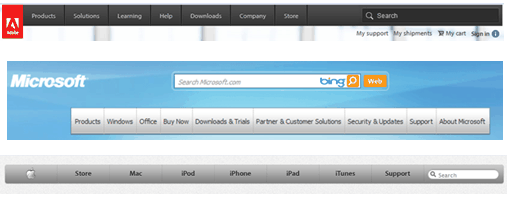
In fact, note that each slim banner features global navigation buttons that are all a shade of grey or charcoal; simple, muted, if not boring colors.

IA comparisons of Adobe and Microsoft
4. Products, not corporate information
This will drive corporate communicators crazy, and will elicit loud, bawdy cheers from the marketing department: the home page needs to feature products and services above all else. Note the absence of traditional corporate website content in all of the above sites including:
Banner ads
Stock ticker
Stacks of news headlines
Executive photos, quotes or speech highlights
These corporate website leaders provide access to key information, promote key products, and provide multiple navigation paths to information. Foremost, these home pages promote products. In fact, news is contained to a very slim one line ticker on each of these sites.
The truth is abundantly clear: no one cares about your press releases or your latest SEC filing, but they do want to buy your products.
5. Social media isn’t important
Social media is important, but not necessarily on your home page. Regardless of all the hype and buzz, very few people care about your Twitter account or your Facebook page. However, to the previous point, they do want to learn about your products, right from the home page. Yes, they may continue their research by using Twitter, or they may become a true fan and head to your Facebook site, but these typically represent a small portion of the standard customer base (e.g. Coca-Cola has more than one or two billion customers, but on Twitter, they only have 171,000 followers).
Not surprisingly then all of the above home pages have no social media on their home page: not even a logo link to their Twitter account. Social media is important, but it will always take a backseat to the corporate home page.
View the related webinar Learning from the Best-of-the-Best Websites.
Related Articles
Design I: Making your site pretty can get ugly
Information Architecture – the science of site layout
Best Practices for Managing a Government Website Redevelopment
Toby Ward, a former journalist and a regular e-business columnist and speaker, is the CEO and Founder of Prescient Digital Media. His white paper “The Social Intranet” is a free download at www.PrescientDigital.com


