Information Architecture – The Science of Site Layout
Can't find what you need? This is a classic symptom of a faulty intranet information architecture. Fixing this problem varies from organization to organization, but always involves using simple vocabulary, showing the "big picture", being clear, and picking the right design for your information architecture. The end result is better navigation and usability, and a significant improvement in how quickly users can access the information they need.
The
Information Architecture Institutedefines information architecture as "The art and science of structuring and classifying web sites and intranets to help people find and manage information". Creating an information architecture (IA) is indeed half art and half science, requiring a variety of talented and creative people who understand the psychology behind the way users think, but aren't afraid to improvise. Given IA's impact on efficiency, it is essential that organizations understand how to use information architecture to enable employees to make the best use of their time.
Within the context of portals and intranets, information architecture provides a simple yet effective way of organizing the information on your site so that each page or section falls under another larger category. Laying out information in this fashion is intuitive because most users perceive a piece of information, data or file as being a subset of a larger set, eventually leading all the way back up to the homepage.
While information architectures vary significantly from organization to organization, there are a few basic elements that all IAs should incorporate to make it the quintessential touchstone document for the development of a high performing intranet or website.
1. Simple Vocabulary
Whether the site in question is ultra-technical in nature (e.g. how to build a 747 aircraft class engine) or simple (e.g. how to boil water), it's important to keep the language within the IA intuitive, straightforward and distinct.
The IA will be used by all your audiences: Project Managers, Content Providers, Techno-geeks, Site Architects, as well as layout Designers. Each one of these groups share the need for vast amounts of information about the site, but differ in the specific information they require and the terminology they will use to find it. An information architecture document with clear, consistent language and terminology is a critical first step for housing the information each audience segment requires and for determining how they will locate this information.
2. Show the “Big Picture”
An IA should depict a conceptual structure and organization of a site’s content, and not be confused with a navigation map – which provides the full-blown navigational details of a site.
An IA provides an overview of the:
paths a user can take
actions required by the user to follow the paths, and
results of the combined actions and paths selected.
3. Be Clear
There are many options for how you can present your content to your site visitors: alphabetically, by subject area, and by author, to name a few. The best way to organize your content depends on factors such as:
Your intranet’s target audience – management, new hires, shift workers, etc.
Goals (quantitative) & objectives (qualitative) for your site and for users visiting the site,
The size of your site – both current and planned (growth).
- Nomenclature/terminology used throughout the organization
Once you have answered these questions, you are better able to determine the labelling language you will utilize – for both the IA and site, as well as what type of IA design to use.
There are several IA layouts to choose from; some of the most common ones are pictured below:
All in one

The simplest of IA designs, an All-in-one layout has all content living on a single home page location. This makes for a very simple and straightforward user experience. This approach works well for small sites with little content, and has the up-side of requiring very little maintenance. For most organizations (which may have hundreds of thousands of pages on their intranet), the All-in-one layout is unrealistic.
|
|
|---|
Flat
A flat Information Architecture structure is laid out so that all pages are presented as peers. With no parent-child relationships, each page can be accessed from every other page. This style is also known as a “monocline grouping.”

This design type is usually applied for sites with limited number of standard topics: Home, About Us, Products, etc….
Indexed

Similar to the flat structure, the Indexed IA design is organized intuitively (or at least it is supposed to be), and has the aid of a table of contents. The indexed design is a better choice than its simpler cousin when there is a moderate amount of data to be accounted for. This design is best suited for data that can be easily and logically organized, for example, alphabetically, such as a phone directory, or parts list. When a site has a large amount of data to be indexed, a search based design is a better IA structure selection.
Hierarchical: Strict & Multidimensional
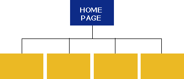
This is the design where protocols and permissions come into play. It is the most common choice for sites with a lot of content. With hierarchical designs, there are parent pages with multiple child pages for users to link to.
In a
Strict Hierarchicaldesign, access to lower level child pages is restricted through their parent pages.
This model is used where there is a direct and exclusive relationship between the parent and child pages that is not shared with the site’s other content. For example, a retail clothing site could organize its pages by product type – a shirt cannot be listed as part of the pants section. This style is also commonly used for sites with message boards.
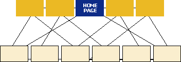
A
MultidimensionalHierarchical
IA design provides a site map where content can be accessed from various pages and methods or search patterns.

This IA design relies heavily on the properties or metadata of the site's content. An example of this would be
Indigowhere the user can find a book selection through various search options: title, author, ISBN/UPC, Editor and Publisher.
Download Information Architecture for Intranets Whitepaper (2012)
To learn more about how Prescient can help improve the information architecture of your organization's website or intranet, please
.
Prescient Digital Media is a veteran web and intranet consulting firm with 11+ years of rich history. We provide strategic Internet and intranet consulting, planning and communications services to many Fortune 500 and big brand clients, as well as small and medium-sized leaders.


