Intranet information architecture: don’t reinvent the wheel
By Toby Ward The ultimate goal of the intranet manager, architect is to create an ‘intuitive’ IA with navigation paths that are intuitive or easily understood at a glance.

I can’t find anything!
This is the number one ‘intranet’ complaint of most employees at most organizations, regardless of size, industry and geographic location. Notwithstanding the effectiveness of the search engine which, more often than not, is rated as being somewhere between ‘awful’ and ‘piss-poor,’ information architecture is often the top priority of most intranet managers when undertaking a redesign.
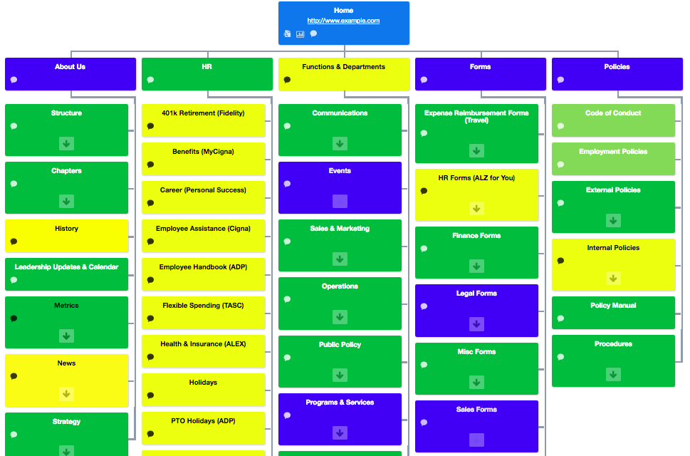
Intranet information architecture (IA) is part science, part art. As it relates to the intranet, the IA is best represented by a site map or organization chart of the major information or content categories (parents) and the sub-categories (children) and how they all relate to each other. Intranet information architecture is generally defined as the content structure of a website or intranet, or the structure or framework for how content is categorized and labeled in relation to other content. In short, IA is the art and science of structuring, labeling and categorizing content.
Intranet information architecture sample, Prescient Digital Media
And yet, most intranets fail to understand the most critical component of an effective intranet information architecture — employees need to construct the information architecture. This is not to say that actual employees do the physical architecture, but rather must be involved in the process and formally engaged via interviews, testing, and card sorting. An expert should craft the final information architecture, but not without first intimately knowing and understanding the common vernacular, language, and specific needs of the employee audience.
You wouldn’t design your own building would you? No, nor would an architect design and construct without your input and feedback.
The ultimate goal of the intranet manager, architect and/or consultant is to create an ‘intuitive’ IA with information categories and navigation paths that are intuitive or easily understood at a glance. Of course the principal challenge of any information architect is that what is intuitive to one person is not always intuitive to another. In other words, you cannot borrow or replicate an award-winning intranet information architecture from some other organization – it will not work.
When redesigning an intranet or portal, there is a natural inclination to reinvent the IA to best reflect ‘best practices’ and/or the IA or labels used by others with successful and intuitive IA’s. This of course is a dangerous trap. No outside consultant or architect could truly appreciate and know intimately the culture and the formal and informal corporate nomenclature as those who have worked for an organization for years.
Often the best labels for a content category (intranet section) is the label, that may not be that sexy, but has been there for 8 or 10 years, and all employees have come to know intuitively. For the information architect doesn’t reinvent the wheel by creating sexy labels (think about the My-this, My-that labels (My Career) that were so de rigueur some 10 years ago), but labels content so they’re the most visually intuitive at-a-glance to all employees.
Firstly, no two organizations are the same. Notwithstanding different industries and services, each organization (even closely related competitors) may in fact differ in very significant ways:
- Corporate priorities
- Corporate values
- Target audience & customer base
- Management
- Culture
- Geographic locations
- Personal life experiences and preferences
- Career path & development
All of the above factors, and many others (including dozens and perhaps hundreds of sub-factors), influence an individual employee’s definition of 'intuitive.' Therefore applying labels and schema from one company to another makes absolutely no sense and is reckless in principal.
Here are some general guidelines and best practices to apply to each intranet redesign:
1. The vast majority of practical and most popular content should be no more than three clicks from the home page (this is impossible with millions of pages of content, but note the emphasis on majority).
2. Major parent categories (major sections or channels that represent virtually all the content on a corporate intranet) should be limited to six to eight, including sections for:
- About Us (Corporate profile, business structure, bios, directory, etc.)
- News (news stories, announcements, events, etc.)
- HR (human resource related information and tools)
- Products & Services (and/or customer related information)
- Forms and/or Tools (an aggregate section of links or originals)
- Policies and/or Procedures (an aggregate section of links or originals)
Other common parent categories (relevant to some organizations but not others include:
- Customer service
- Career / Learning
- Roles / Dashboards (sales, operations, administrative, etc.)
- Library / Reference
- Help
3. Beware of catch-all sections such as Resources or Information that become dumping grounds for everything that doesn’t fit in other sections rather than finding it a true home.
4. Navigational / usability elements such as Search, Site Map, Help, Contact Us, Feedback, etc. need not be in a parent category per se, but should be available in the main navigation banner and/or footer.
5. Card sorting exercises that allow users to determine content groupings and labels are extremely valuable for fixing navigation and usability problems.
6. Do not bury or overlook highly desirable but not necessarily mission-critical items that are usually very highly sought by employees including:
- Cafeteria menus
- Buy-and-sell / Classifieds
- Job postings
- Weather forecast
- Office locations & maps
Most corporate intranets feature weak information architectures that require careful thought and some work to enhance. But completely scraping and reinventing the IA at the expense of years of common, learned behavior may well further confuse and irritate your employees who are already complaining that they “can’t find anything!”


