“Our intranet is ugly” – Intranet design 101
Your intranet is dated, unfriendly, and ugly. It’s certainly not being used to its fullest extent because users simply don’t want to engage with it. And while employees claim that they would likely use it more if it weren’t so hideous, there is more to user experience in the workplace than just your modern web design.
Firstly, let’s break down user experience in the context of your corporate intranet. Starting from the top, your intranet’s primary function – in some way or form – is to connect your employees to the information they need. By this premise alone the key focus of your re-design should not be the design, but rather the experience. In other words, how your users are interacting with information, and not necessarily just how it looks on the pages.
Information architecture & Navigation
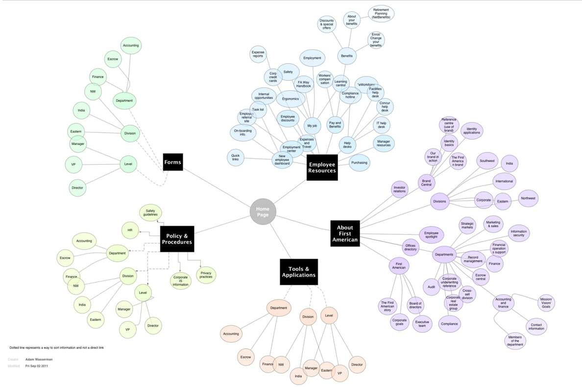
Information architecture is the art and science of organizing shared information environments, to support usability and findability. Is the information on your intranet organized in an intuitive manner? How well has content been grouped, categorized, and tagged? Very often, especially as intranets grow over time, information can be segmented (or “siloed”) by functional area or department. But that can have very negative effects on important facets of the intranet such as governance and content management. Instead, try revisiting the content groupings with the intention to simplify where the different types of information live. This also means being able to characterize your content in multiple ways; a form, a policy, a web resource, a video, an announcement, a discussion, an article, as well as by organizational function. Ensuring that this metadata is captured, and the appropriate content and sections are characterized and tagged, improves more than just the user experience. It also enhances search, accountability and ownership (governance), and all aspects of information management throughout the content management lifecycle.

For the intranet to serve its audiences adequately, employees should be able to easily navigate through its sections in order to find what they’re looking for. Try thinking of things from a new employee’s perspective; if you’re new to the intranet and needed to find something to reference or to complete a task, how difficult would it be? Are the naming conventions sensible and do they accurately reflect the content within? For employees to explore through the site, they would expect it to be as easy as traversing through an external news and information site. When re-designing your intranet, take the time to revisit how your information is structured and organized.
Personalization & Customization

In what ways is the intranet tailoring its experience to the employee? This can be done numerous ways through either personalization, or customization, and typically a combination of the two. Personalization is when the intranet tailors the experience itself, depending upon who is accessing it and from where. A simple and common example is that if the intranet knows you’re from Marketing, and you’re a director, then it brings all of the relevant news, updates, links, and tools all to your view – front and center. This would mean that when you log on to your intranet, the information and content you see on your home page would be different than the person from Accounting down the hall. This can also be done by location, such that the branch office experience is different from corporate, or the Los Angeles office doesn’t see important updates from New York. This of course requires a few supporting intranet elements behind the scenes, including the appropriate technology, governance, and content management practices.

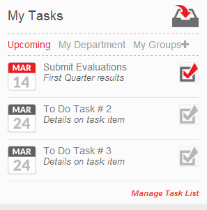
Beyond personalization are customization features – giving the user the option to tailor their own experience. This can be done in many ways, including enabling users to customize their own links or dashboards so that they have quick access. From a communications standpoint, enabling employees to also subscribe to various content streams vastly improves their experience. This way, they aren’t only subject to information pertaining to their location or department, but also other areas, communities, and projects that truly interest them.
YOUR workplace experience
Instead of thinking of your intranet according to technological or industry best-practices, focus on your own organizational culture. How can the intranet translate the branding, engagement, and values that exist within the office? In other words, think of your digital experiences similar to your real office experiences. What behavior does your workplace incite, and how can that be encouraged on the intranet? We are living in a time where the work-experience is shifting. More and more companies are working remotely and breaking down hierarchal barriers. From a technological standpoint, more and more solutions focus on synchronizing (e.g. via the cloud), or engaging (e.g. social tools) with one another to collaborate and otherwise work smarter and more effectively, from anywhere. This also can complicate the digital ecosystem within your company. That is why it is even more important to first determine what portions of the work experience you want to bring into the digital workplace.
Of course, internal branding is key to the look and feel of your intranet. Therefore, try to make the intranet experience unique where you can, through colors, fonts, media, and other style elements. This doesn’t necessarily mean that the intranet will look the same as your customer-facing site looks, but it doesn’t hurt to show employees that you care just as much about engaging and retaining them as you do your customers.
Beyond simply the look of your intranet, is its utility. Your intranet can be visually stunning, but ultimately useless if it doesn’t help users access what they need to do their job. Your intranet does not have to inspire awe by its screenshots or mock-ups, but it should be a place where everyone needs to go as a part of their daily routine.
Writer Bio
Aadam Zaidi is the Director, Client Services for Prescient Digital Media, and has helped drive numerous global intranets from concept through to adoption. He is especially keen on emerging social media and communications trends.
Related Links:
Intranet Gamification- Doing it right (Part 1)


