Telephone: +1 416-926-8800
Dissecting Intranet Designs
A detailed look at some of the best intranet designs and dissecting some of the best and worst design elements.
Intranet design begins with people and process – average employees, top executives, intranet stakeholders, and sound planning and policies that allow for efficient use and retrieval of content and application. That's what employees want above all else, not to be dazzled with design, but fast, responsive intranet content.
It’s not easy to build a great intranet. In fact, the best intranets are years in the making – sometimes requiring dozens of individuals and millions of dollars. There are some good intranets created and launched with only scant few thousands of dollars.
However, money is not always a requisite requirement for a great intranet.
Great intranets have mastered the twin pillars: people and process. Technology, is necessary, but anyone can buy SharePoint or Oracle.
The best intranets always have key, mission-critical ingredients:
- Strong executive sponsorship
- Detailed governance and accountabilities
- Strong content (and content management)
- Engaged stakeholders and employees – before and after launch
- Simple, effective user experience
Duke Energy
Technology: SharePoint Online and Microsoft 365.
Employees: 47,000
Headquarters: Charlotte, North Carolina
Duke Energy is one of the largest electric power holding companies in the US, supplying and delivering electricity to almost 8 million customers in the East and Midwest.
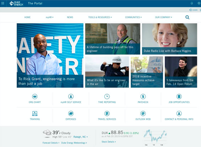
Duke is a two-time winner of the Intranet Design Annual Best Intranet of the Year award. It’s new intranet portal features a simple but elegant home page, and dozens of reusable webparts that are reused across the enterprise digital workplace.
News can be published to the intranet home page, other intranet webparts, or to one or all of more than 400 physical digital signs located in elevator lobbies and cafes in offices and facilities across the Eastern and Midwest United States. The focus therefore is on content, and the webparts that deploy the content, not the design (or bells and whistles).
The redesign of the award-winning intranet was executed in Agile (in two-week sprints), instead of the traditional Waterfall approach, and took approximately one-year.
DISSECTING THE DESIGN:
Duke does not employ the most sexy design, but it is very clean and functional, and closest to what the average employee is looking for from an intranet or digital workplace home page: minimal scrolling, minimal banner, quick access to the most important tools and content, and news at a glance. The average employee does not want to scroll down a large home page; people like to scroll if it’s the content they’re seeking out and want to read. Employees want intuitive access to the intranet content and apps that they need to do their jobs.
Duke has created a home page design that minimizes the design elements, and instead emphasizes top news and the most frequently sought after tools and apps. It is within the basic SharePoint wrapper, which they’ve not customized. Instead, the customization has been limited to the webparts. In other words, the emphasis is not on design, but content.
The weather webpart is an interesting design flourish, however, if you ask most employees, they would say this is a waste of space – they know what the weather is (and already get it on their phone, watch or browser).
Cox Communications
Technology: SharePoint 2016
Employees: 20,000
Headquarters: Atlanta, Georgia
Every intranet redesign needs a solid business case – and executive support. Afterall, an intranet redesign has less to do with design, and more to do with function.
Cox is the third largest cable television provider in the US, serving more than 6.2 million customers, including 2.9 million digital cable subscribers, 3.5 million Internet subscribers, and almost 3.2 million digital telephone subscribers, making it the seventh-largest telephone carrier in the country.
Before Cox began their intranet redesign, Chris Harrer, Director, Digital Communications, undertook 6 months of research with countless dozens of executives, managers and frontline users -- anyone that wanted a say or had an opinion about the old, dated intranet.
“For another 6 months, I went and presented to anyone that would listen to me at the VP level,” says Harrer. “I would (put on my sales hat) ask for 30 minutes and sit in their office and walk through the key points and tell them that I just wanted them to be aware that I am looking to create a new intranet. Then came the test…”
Chris created a detailed sales presentation on ‘why’ Cox needed a new intranet. It featured research, user comments, best practices, and leading intranet case studies. For the busy and easily distracted c-suite executives, he created a one-page business case. One page that ‘sold’ the need and benefits of a new intranet.
“From this point I went and presented to each of our SVPs and EVPs with my intention to rebuild our intranet,” says Harrer. “Creating the one-pager (business case) from my 45-page presentation was not easy, but I got all relevant information into one document for executives to look at.”
And it wasn’t merely limited to print documents and presentations. Chris also mastered the art of the elevator pitch and used it whenever he bumped into an executive.
“Your elevator speech (30 seconds, or one-minute). Get that down-pat. Executives have no time, so master the short speech.”
Chris credits his executives, and their support, as the key to the entire redesign process. ““If I didn’t do that, this project would never have gotten off the ground.”
DISSECTING THE DESIGN:
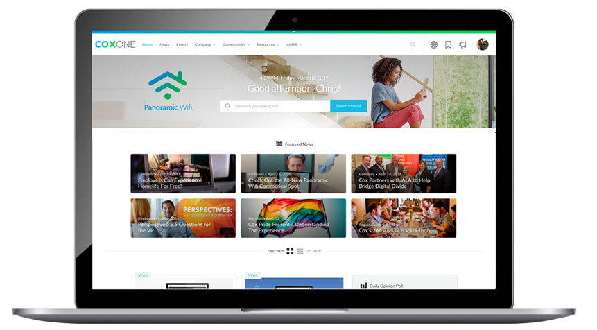
Cox has a beautiful, sexy design – consumer grade, influenced by external facing web design. The banner is superb, very clean and minimal with a great six-bucket information architecture under which all content is placed and classified. There is a heavy emphasis on the search engine, and news.
Unfortunately for the average employee, this looks like a website, and not an intranet. An intranet is not a website – employees don’t want to be sold or marketed to, they want the content and tools they need as fast as possible. Additionally, this home page while beautiful, is a long scrolling page of features and content. Most employees will never (or rarely) scroll down an intranet home page. Again, they want a specific document, policy or app, and quick; they may glance at home page news and features, but they have a job to do, so they don’t view the intranet as they might a website when they’re shopping.
Finally, the page is completely dominated by a stock photo, that eats up valuable home page real estate and emphasizes the search engine and a welcome message. In focus groups, employees tell us that this particular design wastes too much space – the average intranet user will agree (and they don’t need a welcome message, they know who they are).
ConocoPhilllips
Technology: SharePoint Online (Microsoft 365)
Employees: 10,000
Headquarters: Houston, TX
ConocoPhillips is an American multinational energy corporation with its headquarters located in the Energy Corridor district of Houston, Texas in the United States. It is the world's largest independent pure-play exploration and production company and the company ranked No. 95 in the Fortune 500 list of the largest US corporations by total revenue.
The emphasis at ConocoPhillips is content, and less the intranet design. And that content comes in the form of standard intranet pages, but also podcasts, videos and even a print magazine.
ConocoPhillips supplements its standard intranet content, and regular news pages, with podcasts for employees. More than 10,000 employees, and many more contractors, are scattered across 17 different countries. So podcasts help reach more employees, particularly those that don’t sit at a computer station.
The energy giant produces four to six podcasts each month, and the initial cost is minimal.
“To set up our studio and equipment at headquarters cost under $5000, and additional mobile units cost $850 each; and that small investment allows us to connect our speakers with a broader audience,” says Ray Scippa, Director of Publications. “Intranet podcasting offers a low-cost, high-return investment.”
ConocoPhillips intranet podcasts are far more popular with employees than news, and the results are impressive:
- Average podcast has 2,500 to 3,500 “listens” (20-30% of all employees)
- Written news stories typically average 1,500 to 2,000 “reads” (15-20% of all employees)
- One podcast featuring an employee survivor of cancer received more than 4000 listens (26 minutes in length)
Examining the underlying employee engagement, one can safely conclude that engagement with podcasts are perhaps 10x or greater than engagement than news stories. Twice as many employees, on average, hit a podcast versus the average news story (and the average employee spends 15-20 seconds on a news story, versus 20 minutes on a podcast).
DISSECTING THE DESIGN:
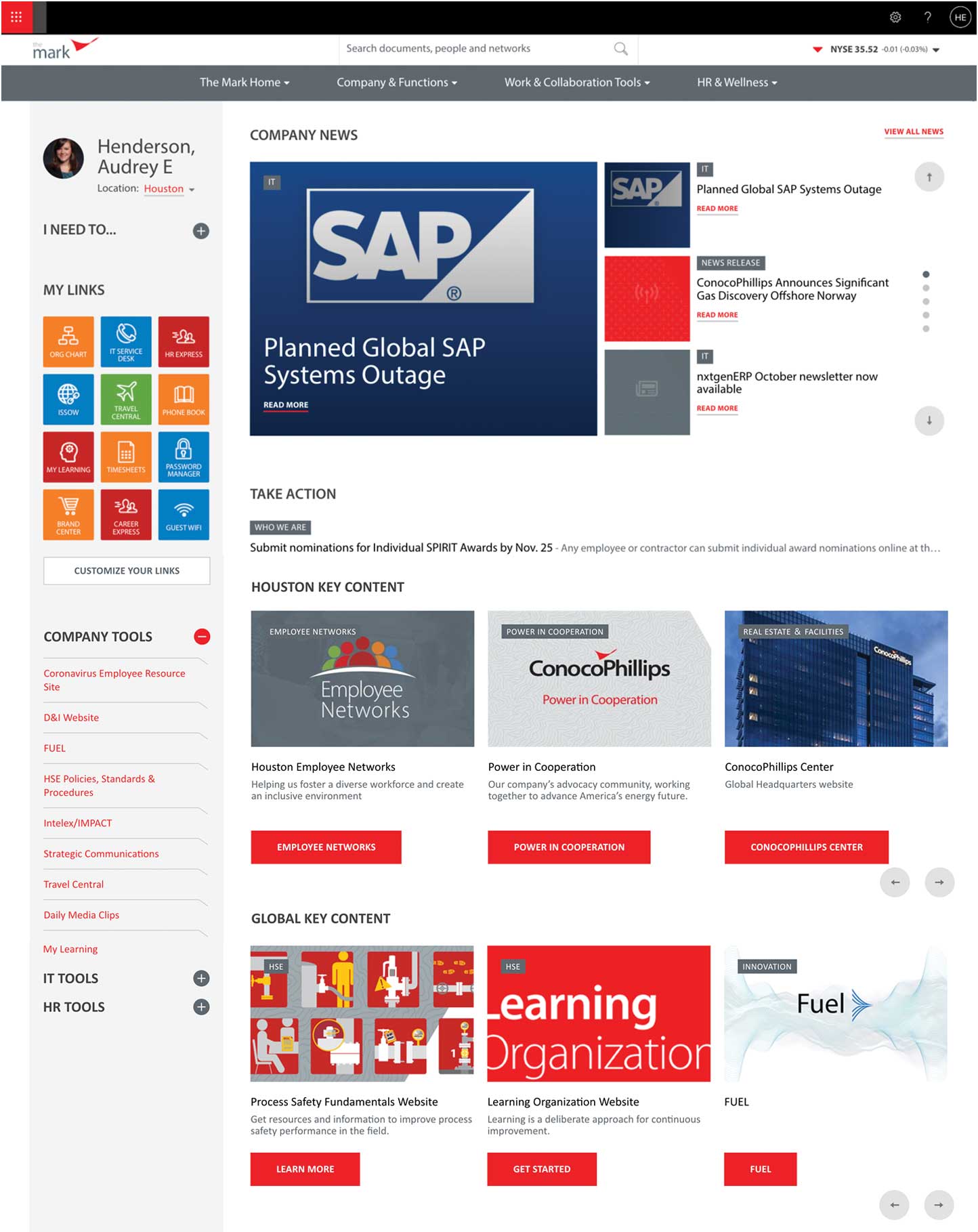
A very colorful design, the employee toolbar in the left column is particularly notable. The toolbar is customizable to the employee, and emphasizes the most frequently used tools and content in My Links. Employees love customization and personalization options.
The banner is minimal though a little odd, dissected into three stripes, black, white, and grey. A little problematic from a design perspective. Note though the search engine is big enough to notice, but takes up minimal space (this is a best practice), likewise the stock ticker.
The average employee will say this page is too busy – there’s too many photos / icons and you have to scroll through it.
Liberty Mutual
Technology: SharePoint 2013
Employees: 50,000+
Headquarters: Boston, MA
Artificial intelligence (AI) is a hot ticket item for some time and has been used on the intranet and the digital workplace for more than a dozen years. However, virtual or digital assistants are fairly new, and are still absent on most intranets.
Digital assistants (also known as enterprise virtual assistants and chatbots) are proving their value, particularly in larger enterprises that may have a sprawling digital workplace with hundreds of tools and applications and millions of intranet pages and documents.
When done right, digital assistants can function as a centralized workplace chatbot, answering questions across any line of business from HR, IT, Finance, Facilities, etc. They can even deliver personalized answers to each employee based on attributes such as their job function, office, department, etc.
Liberty Mutual is an American diversified global insurer & the 4th-largest property & casualty insurer in the United States. It ranks 76th on the Fortune 100. It has more than 50,000 employees spread across nine hundred locations around The World.
In addition to being a pragmatic solution that facilitates quick wins, a digital assistant also aligns the goals of each team, creating a shared success that animates efforts towards corporate-wide digital transformation. That was exactly the result when Liberty Mutual Insurance implemented a digital assistant as part of their employee experience platform. The organization saw a 40% increase in internal comms click-throughs, 70% fewer clicks to obtain key information and a 93% reduction in costs for each help desk inquiry – a clear success across the board for all groups involved.
In fact, their intranet digital assistant proved so effective, they spun-off the application as a stand-alone service and new company that can now be purchased by any company.
DISSECTING THE DESIGN:
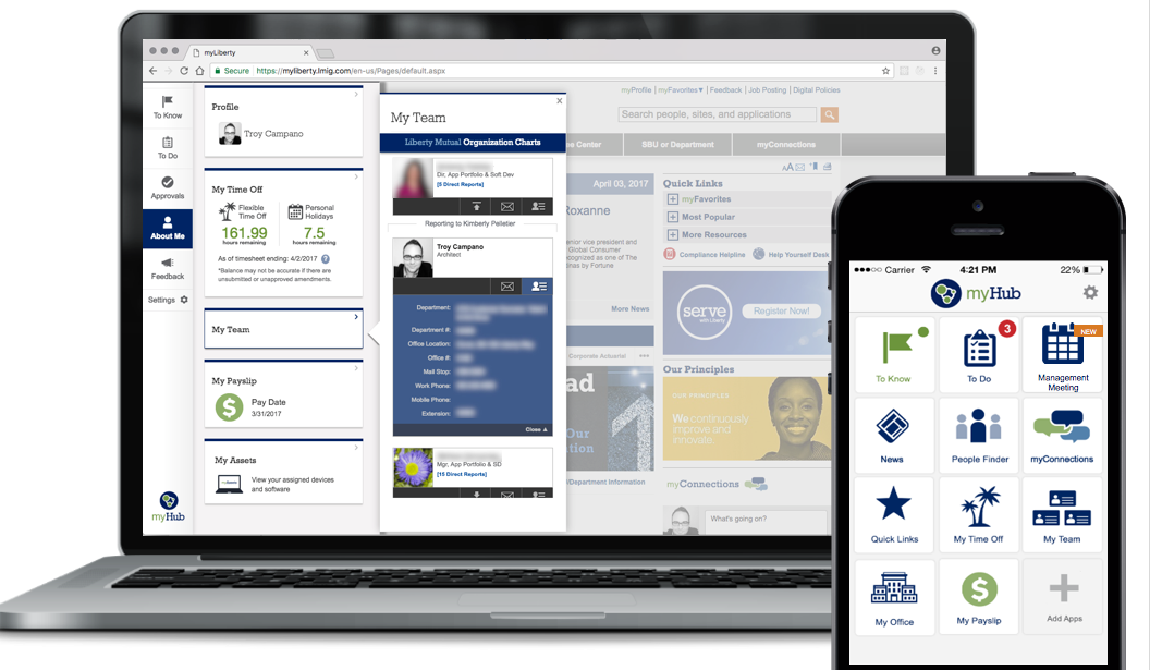
As the screens reveal, the digital assistant and various tools that support the AI solution, called Workgrid, are most visible in a home page toolbar, presented in a far left-hand column of the Liberty intranet home page. The complete solution features three major components: the home page toolbar, a mobile application, and digital alert notifications, all powered by the AI.
This tool is extremely well-designed – simple to use and digest at a glance. It is very minimal, with a very thin left-hand column that supports but does not overpower the intranet home page. The toolbar however opens up when you want more, and overlays the intranet home page.
The mobile app is also very intuitive and functional: a very minimal banner, and all the most common apps are immediately visible on one screen and denoted by smart icons. Additional tools and apps can be added with the “+” icon in the lower left-right hand corner.
Clean, simple, and plenty of white space – just what employees want. A good example of the KISS method in practice (Keep It Simple Stupid).
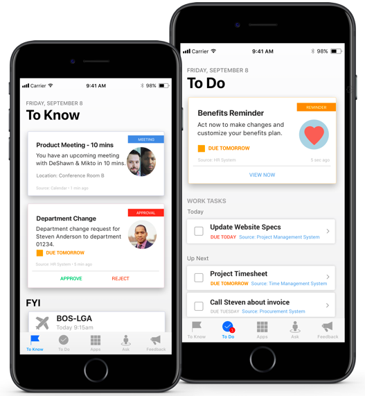
Mobile digital assistant notifications by Workgrid.
OTHER NOTABLE INTRANET DESIGNS:
British Airways
Coca-Cola
McDonald's
Prescient Digital Media
To see additional intranet case studies and intranet designs, watch the full video replay (15 presentations spread over two days) of the Digital Workplace & Intranet Global Forum conference.
Intranet Insight
Subscribe and you will always be updated with the latest news from us.
Follow Us


© Copyright 2026 by the Prescient Digital Media. All Rights. Privacy Policy