Telephone: +1 416-926-8800
Speed as a website strategy
by Toby Ward – On the web, speed doesn’t kill – speed wins. Users want to get at what they want as fast as possible. Throwing impediments in their way will only tick-off your users, and a ticked off user is a lost sale.
Usability and advertising impediments ensure that lack of speed kills. A new study from
Akamai Technologiessays that four seconds is the “maximum length of time an average online shopper will wait for a Web page to load before abandoning it.” Four seconds can kill a customer.
Some of the fabulously annoying features that are sure to tick-off users:
- Pop-up windows
- Slow download speeds
- Moving, floating ads
- Forced registration
A measurable strategic plan is the best guarantee for success online, and many of the best sites factor speed into their strategy (think Google). While some organizations have business models that call for delaying tactics like pop-ups (think New York Times), too many companies put these features on their sites because they lack a strategy to tell them not to.
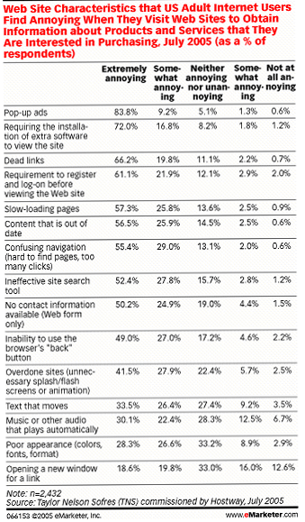
Survey says: pop-up ads are the most annoying website characteristic
If you fall into the latter category, you need to start working on your strategy. Because that can take some time, which is of the essence, concurrent with that development you should clean up your site. Unless you can quantify a revenue stream associated with these features, you best avoid ticking off your users.
When determining what to avoid, consider a survey of more than 2,400 users by
Taylor Nelson Sofres(TNS). It found that the top, most annoying website characteristic is pop-up ads. Hot on the heals of those maddening pop-up ads are mandatory software installations (to view a site users are forced to download a plug-in), and dead links.
The other favorites that round out the top 10 most annoying website characteristics:
Forced registration
Dead links
Slow-loading pages
Out of date content
Ineffective search
No contact information
Inability to use the browser’s back button
Overdone flash and animation, moving text and music and other audio that plays automatically when you enter a website are also top irritants.
Another time killer is the animated or streaming video full page ad that you are forced to watch before you get to the article or content you clicked on.
Because cutting unnecessary functionality is easy and delivers quick usability wins, it’s an immediate step you can take to improving the user experience. As important, although more time consuming, is improving your site design. There are a number of
strategic factors to site redesign, but before beginning the work you should assess whether your site needs it. Checking it for the following syndromes would be a good starting point.
Six syndromes of bad web design
Syndrome #1: Excessive web design.- Offender: www.Chipotle.com. Just try navigating this site.
Overdone “design masterpieces” is the worst syndrome that infuriates my colleague Steve Crescenzo. In addition to being a highly entertaining writer and speaker on communications and writing, he is the author of the following “six syndromes” of bad design.
“Don’t let your web designers run amok,” declared Crescenzo during his presentation (Steve Crescenzo’s worst dressed Web sites) to the 2006 Web Content Management Conference (presented by Ragan) in Chicago. “Let them (designers) play on their own time.”
Here are Steve’s other five syndromes – and top offenders – of bad web design.
Syndrome #2: No useful information.
- Offender: www.AltonBrown.com. The famous chef doesn’t offer recipes!
Syndrome #3: Customization (“half-ass customization”).
- Offender: www.MyCurves.com. Forced registration requires a password that is only available at actual studio – not online.
Syndrome #4: Too much flash.
- Offender: http://www.Adidas.com/Y-3. Waiting for the various elements to load is a brutally painful experience. God bless those that have anything less than a T1 connection.
Syndrome #5: Hiding the most important information.
- Offender: www.Globalaigs.org. The Association of International Glaucoma Societies website is dominated by a spinning sphere and bobbing heads. For a laugh, you have to play the Glaucoma Hymn in the bottom right corner… (“Glaucoma, Glaucoma, Glaucoma. Constricting vision slowly…”). No, I’m not kidding.
Syndrome #6: Terrible ease of readability.
- Offender: www.Tampax.com. Why not bury the navigation links in the bottom left hand corner and rotate the text so that it reads bottom to top? Click on Products… you don’t get text, only thumbnail pictures of boxes that are only readable to the kin of Superman…
Web users are far more fussy, impatient and cynical than average, in-store customers. Users want to be treated like valued customers; don’t tick them off. You have four seconds to deliver the goods. Don’t waste those seconds trying to distract them or impede the mission. Speed sells.
Toby Ward is the CEO and founder of Prescient Digital Media. Download his Finding ROI Whitepaper or read his weekly columns and case studies at www.IntranetBlog.com.
Intranet Insight
Subscribe and you will always be updated with the latest news from us.
Follow Us


© Copyright 2026 by the Prescient Digital Media. All Rights. Privacy Policy